Design Elements That Can Make or Break Your Website
Your website is more than a container for information. It’s a visual representation of your business’s personality and level of professionalism. For many small businesses, their website is the first thing a potential customer will see, and the visuals will stand out long before the consumer has a chance to explore your amazing products or unbeatable services. For that reason, it’s vital that your website design makes a good first impression.

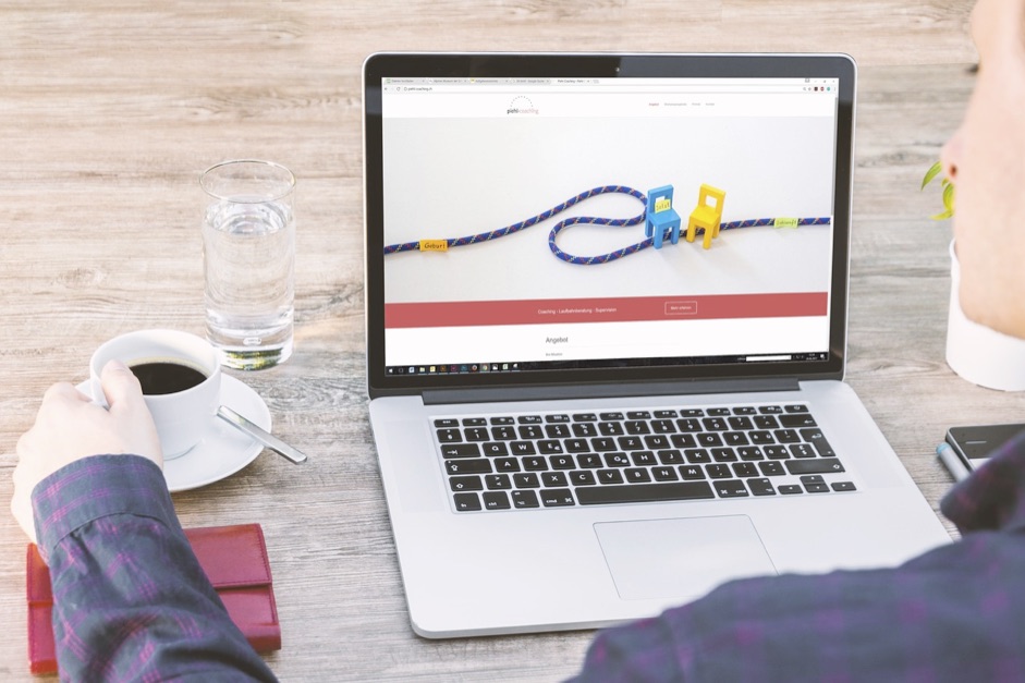
Website Design Example – Image by Coffee Bean from Pixabay
You have no more than a few seconds to grab a visitor’s attention, and in that time your website will have to simultaneously awaken their curiosity, anticipate their needs, answer their questions, and last but certainly not least, please their eye. With the right visual elements, your website can achieve all of these and more. Content may be king, but you first need to convince your audience that it’s worth reading, and that means making your website design visually inviting.
If you’re a small business owner looking to create a successful website, consider these simple but essential elements that can draw your audience in rather than send them scrambling back to Google.
Color and contrast
The colors you use in your website will be the first thing readers will notice, and website design requires a thoughtful approach to graphics, background color, and contrast in order to strike a visually pleasing balance. It’s also important to remember that visitors use a variety of devices to access the web, and different screen sizes and types may impact viewers in different ways.
Experts recommend using neutral colors for a background, and avoiding flashing graphics and loud fonts. When in doubt, aim for minimalism. Avoid clutter and stick to a visual hierarchy. Keep distractions to a minimum and make sure the eye is led to the most critical parts of your content. This way, visitors will feel naturally drawn in, and more likely to explore the products and services you have to offer.
Font and Typography
Readability is an underappreciated element of website success. But one look at the history of typography should tell you that the visual presentation of words, sentences, and paragraphs can drastically impact how we interact with the world.
The first goal is to choose a font that’s both visually appealing and representative of your business. Comic sans has gotten plenty of scorn, and for good reason–it creates a feeling of juvenility and unprofessionalism. Find a clean, professional font with nice line height and even letter spacing. Make sure it reflects your business’ products or personality. Avoid long blocks of text, break up content with bullet points, and make sure to use banners and headers to communicate natural breaks in your content.
Website builders are a great way for small businesses to make sure their websites have a professional sheen to them. A quick glance at Weebly’s prices
, for instance, demonstrates that you can achieve an appealing, professional looking website while maintaining your bottom line.
Graphics and images
We may have advanced past picture books, but there’s still a little part of each of us that’s drawn straight to images. This makes sense, and should be taken into consideration when designing a website. Create eye-catching logos and display them prominently. It’s best to use images sparingly, and to make sure they reflect the message of the content they’re supplementing. Avoid stock images if possible, and keep to a unified theme while subtly diversifying the images in the photos you use.
Appeal to The Eye and the Sales Will Follow
It’s obvious that the purpose of a business website is to make money. This may lead you to think that it’s a waste of time and money to focus on artistic or aesthetic elements. But nobody likes having their retinas burned by blinding colors and ill-contrasted images, and these will certainly drive customers away from your website before they even have a chance to see how great your business is. So don’t underestimate the visual aspects of your website design. You don’t need to be Da Vinci, but you should make sure your site is pleasing to the eye and inviting for the customer.

