Website Images: Are They Really That Important?
With the rise of image central social networks like Instagram and Pinterest, we have learned to process information extremely quickly through visual cues, forming impressions within seconds. In order to make your message understood, it is therefore essential to accompany this with related imagery to ensure an almost instant understanding of what is being communicated.
We have identified some tips to ensure your images enhance – not hinder – your website:
Choose eye catching images
It is essential to ensure the images used on your site reflect your company values, look professional and effectively frame your content.
Imagery should relate to your offering, but doesn’t have to be literal. For example, if you sell fire safety equipment, a static image of a fire extinguisher might not be as engaging as an image of a fire being extinguished. Consider how to best catch the eye of the consumer as soon as they land on your site.

Consistency is key – just as you should replicate your company’s tone of voice across all communication through the website and social media, the style of imagery you use should also be consistent to affirm your brand identity and build trust in your customers.
The Jaguar website is a great example of this – they only use high quality lifestyle shots of the cars on their homepage, enhanced in post-production to look as if they are moving, to infer the speed of the vehicles. They haven’t confused the message by including product shots of the cars on white backgrounds, or any imagery containing people – it’s all about the cars and it’s consistent.

While you may not have the budget or resource to produce images of this high a quality, it is important to consider how all of the images on your site complement one another and represent your brand.
Use images to sell
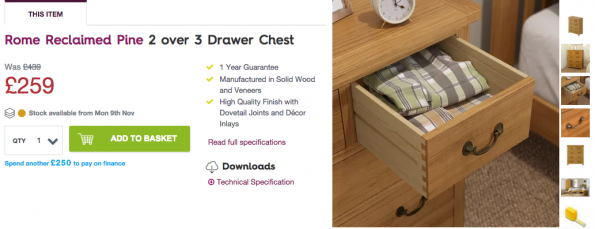
If you are selling products on your site, it is essential that you provide as much imagery as possible to give consumers the best possible sense of how the product looks. Mix lifestyle shots in with product shots where appropriate, i.e. if you’re selling a piece of furniture, show the product on it’s own but also include it in a decorated room to give an impression of how it can enhance this space, or if you are selling clothing show this on a model styled with other items to show how it fits a real person rather than just shots on mannequins. Victoria Plum offer a range of product images including shots of the furniture in use:

With the absence of the ability to touch and feel the product, give customers the opportunity to see the product from every angle where possible – 360 photography can enable you to let consumers rotate the product to see every angle.
People buy for emotional reasons, so consider how you can appeal to users’ emotions when selling your products – especially if they are high value purchases. For example, holiday companies often include smiling couples or families in their photographs, appealing to consumers’ emotional attachments to the loved ones they will be taking the holiday with.
Be selective with stock photography
Stock photography can be extremely hit or miss – it can be utilised by companies who do not have the budget or resource to take photos in-house, but it can often be misused when cliché or inconsistent imagery is used.
If you need to use stock images, take some time to browse the resources available – there are a wealth of websites offering free and paid images, of varying quality. Sites such as Stocksnap contain free images supplied by photographers, which are much more creative than some of the other platforms providing generic images. Shutterstock is a great resource for paid imagery, with packages available to save you money when buying in bulk.
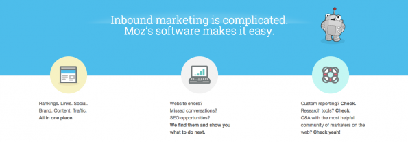
Consider using iconography or illustrations instead of photography if you are struggling to find good images. Some companies, such as SEO specialists Moz have produced an illustrated mascot, and use attractive iconography across the site which consistently communicates their brand values:

Add team and company photos
Including images of the team can give your brand a face and personality online. Browsing online is in the most part an impersonal experience, so help your customers to connect with you by showing images of the people who own and work at the company. People buy from people, so this is an effective way to convey your company’s culture. Images of the office can also help to attract customers and potential new employees, by giving a sense of the environment you work in. This enhances the legitimacy of the business, and can be much more engaging on your ‘Contact Us’ or ‘About Us’ page than a generic stock image of a call centre worker.
Studies have shown that on average, over half of users spend less than 15 seconds on a website*. This gives you an extremely short window through which to communicate your message; follow these tips to ensure your imagery helps you to convert visitors into customers.
Source: https://www.creare.co.uk/advice-centre/website-images-are-they-really-that-important
*Sources:
http://blog.hubspot.com/blog/tabid/6307/bid/33423/19-Reasons-You-Should-Include-Visual-Content-in-Your-Marketing-Data.aspx
http://blog.hubspot.com/marketing/chartbeat-website-engagement-data-nj
http://www.jeffbullas.com/2012/05/28/6-powerful-reasons-why-you-should-include-images-in-your-marketing-infographic/
Image sources:
https://en.wikipedia.org/wiki/Fire_extinguisher
http://www.stockvault.net/photo/102582/arcadia-fire
https://victoriaplum.com/product/reach-for-the-sky-2-over-3-drawer-chest-in-reclaimed-pine-repi04
https://moz.com/

