How to Effectively Visualize Data Using a Stacked Chart
Data visualization is essential for businesses, researchers, and data scientists to understand and interpret complex data sets. Seeing patterns, trends, or irregularities becomes hard in astronomical amounts of data.
Maximizing the Potential of Stacked Charts for Data Visualization
One popular and effective method used in data visualization is the stacked chart, a multi-layered graphical representation that allows a part-to-whole comparison over time or categories. This article explores how to effectively use a stacked chart to visualize data and its importance in data analysis.
Understanding the Basics of a Stacked Chart

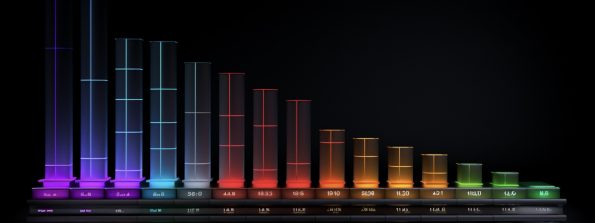
Alt text: An example of a stacked chart with rainbow bars and a black background.
As the name suggests, a stacked chart stacks data series on top of each other in a single column. It’s a graphical representation that breaks down and compares the parts of a whole. Each bar in the column represents a total amount, while segments of the bars represent different parts or categories of that total.
The colors’ intensity in the chart generally represents the data value they stand for. A higher value correlates to a stronger intensity. This representation allows for comparing individual contributions and their relationship to the whole.
Stacked charts are particularly useful to demonstrate how each category contributes to the total across different conditions or over time. They are typically found in finance, marketing, sales, and research.
Importance of Visualizing Data With Stacked Charts
Using stacked charts for data visualization brings a myriad of benefits. One of the key benefits is that it helps to understand complex datasets clearly and simply. Visualizing data in this form makes identifying patterns, trends, and deviations easy. This supports accurate decision-making and strategizing.
The effectiveness of stacked charts extends beyond just simplifying data. It’s a powerful analytical tool that provides insights and highlights significant details that could be missed in a dataset. It provides a consolidated view to compare different data groups and their individual contributions to the total, making it a good fit for multi-level data analysis.
Stacked charts can also enhance the communication of data features since human brains are generally better at processing visual information than raw data. Businesses often use stacked charts to present their findings or share insights derived from data with their stakeholders or clients.
Steps To Create an Effective Stacked Chart

Alt text: A person working on a computer looking at two screens utilizing data to create a stacked chart.
Creating an effective stacked chart involves several steps. The first step involves understanding the data set. The data should be thoroughly analyzed to check for multiple variables suitable for a stacked chart representation.
The second step requires selecting appropriate categories and values. It’s important to strike a balance not to overwhelm viewers with too much information. The number of categories and their order significantly impact how the chart is interpreted.
Next, it’s essential to ensure that the colors used are well contrasted to stand out against each other. This enhances the readability of the chart. Similarly, the labels should be clear, easy to read, and provide relevant information about the data set.
Maximizing the Power of Stacked Charts for Data Analysis
To maximize the potential of stacked charts, you need to understand when and where to use them. Stacked charts are most effective when illustrating part-to-whole relationships where you want to highlight total value across categories. They also shine when comparing the total and one part of the categories.
It’s important to know that the readability of a stacked chart decreases as the number of categories increases. So, if you have many categories or need precise comparisons, a different chart might be a more advisable choice.
Furthermore, ensure you adopt best practices such as maintaining consistency in color coding, including clear labels and limiting the number of categories in the stacked bar. These best practices will help ensure your stacked chart is effective, accurate, and user-friendly.
Stacked charts are powerful tools for visualizing complex datasets and discerning patterns and trends at a glance. By understanding and avoiding common mistakes in their creation, you can leverage their strengths to communicate effectively and make informed decisions based on data.

