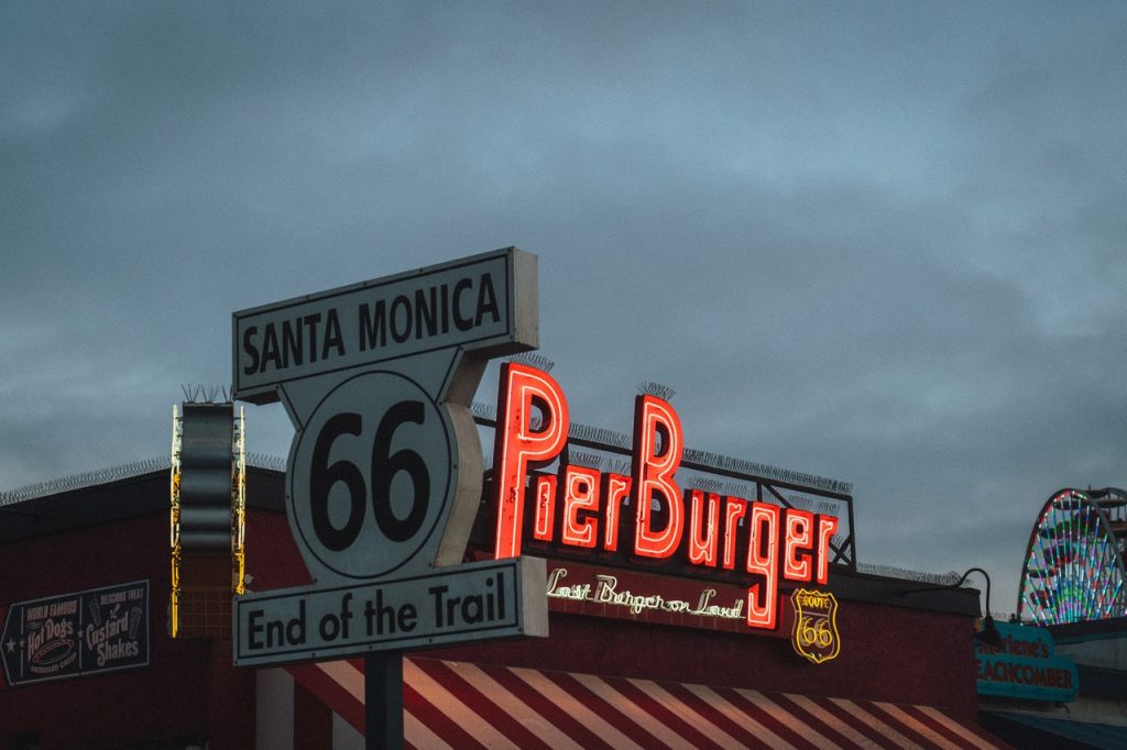
The Principles of Good Retail Signage
Retail signage is one of those things that most store owners don’t spend much time thinking about. But when it comes down to it, it’s probably one of the most important elements of your curb appeal (which is what invites people inside).
With that being said, it’s time to take it seriously.
The Power of Retail Signage
Retail signage is more than a combination of plastic, aluminum, paint, and electrical components. It’s a vibrant extension of your business – a magnet for eyeballs and a beacon of branding. And out of the dozens of benefits it provides, the power of store signage really boils down to a couple of factors:
- It grabs attention. When you have a beautiful glowing sign elevated above your storefront, it makes people pay attention. A good sign makes it hard for people to forget about you.
- It builds brand awareness. Store signage is especially hard to ignore when you’re located in a highly-trafficked area. Whether it’s a store inside of a busy mall or a building on the side of the interstate, a lot of people pass by on any given day. This is free exposure.
While there are hundreds of different ways to advertise a brand, good retail signage might be one of the most effective. This is a combination of timing, placement, and visual appeal.
As entrepreneur Omar Rahman puts it, “Point-of-sale signage that advertises perfume to someone in the Dior shop in Dubai Mall is clearly more likely to be relevant than the same perfume advertised on a radio segment. It is contextual, and therefore more impactful.”
What Makes a Good Retail Sign?
Not all retail signage is created equal. Some signs are much more effective
than others. Here are some elements that make a good retail sign:
1. Simplicity
The biggest issue businesses have with signage design is the desire to do too much. They want to include lots of colors, elements, text, and graphics. The problem is that this rarely converts will. Because even if it looks good, it typically creates confusion.
When designing a sign, you have to think about what it’s going to look like from far away. You might be able to read a small subheading or identify with an intricate design when looking at a rendering blown up on a big computer screen, but will a customer be able to read it from 100 feet away?
Simple is always better than complex. Strip away any unnecessary elements and try to focus on what matters most: Your brand name and/or logo.
2. Durability
It’s not enough to have an aesthetically pleasing sign. You also have to think about elements like durability. Work with a company that specializes in sign design and manufacturing, like AlphaGraphics. They understand which materials to use based on where the sign will be placed. For example, will the sign be inside or outside? And if it’s outside, will it be directly exposed to the elements or sheltered under an overhang? The answers to these questions will influence how the sign is made.
3. Visibility
Sign visibility is a big thing. Some signs look great during the daytime, but are almost impossible to see at night. (And in some situations, signs look great when they’re lit up at night, but are hard to discern during daylight hours.) Visibility is arguably one of the most important factors, so don’t take this for granted!
4. Location
Finally, you have to think about where the sign will be located. Think about where your store is situated in relation to the road/parking lot/walkways. Do you need multiple signs to direct people into the store? Or can you get away with one large sign?
The location of your sign is key. If you want a shop front behind the front window, then a digital sign that can be updated at any point could be the best choice. In the long run they’re usually cheaper and better for the environment. Use this ultimate digital signage guide for retail to find out more information.
The location of your sign will dictate other factors like size, lighting, and (as discussed previously) the materials used. Don’t wait until after the sign is designed to choose a place. You need to lead with this decision.
Putting it All Together
There’s no such thing as a perfect
retail sign. You have to consider the many variables and brand-specific factors to optimize your retail signage. However, if you follow the tips outlined above, you’ll find it easier to grab attention, build brand awareness, and – ultimately – generate sales and revenue.


I liked it when you shared that people will pay attention when you have a beautiful glowing sign elevated above your storefront. This will help to build awareness of your business which will help increase your profits. I would like to think if a store owner is planning to have retail signage, he should consider hiring a reliable service that can make it look attractive.