How to Design an Effective Leaflet for Your Business
If you’ve ever considered using leaflets and other printing marketing materials to market your business (or if you have actually used them in the past), chances are that you assumed the process was pretty straightforward.
I did, and this is the process I took previously: I had the aim of my leaflet in mind (which was to promote a special discount/offer in my case), then I went out, found a great designer, and told them to get to work.
Unfortunately, my leaflet was a complete failure (i.e. hardly anyone actually ended up taking me up on the offer I was running).
Now, I’m not saying that this doesn’t sometimes work (in fact, it probably will in some cases), but in most cases, this simply isn’t going to cut if you actually want your leaflet to be effective and generate a return on your investment.
The reason for this is simple: there’s actually a lot more to a successful leaflet design than the actual visual design, and this is the common mistake that a lot of business owners make.
In fact, roughly 80% of the design process is non-visual and involves things such as the layout, USP, copywriting, and demographic suitability, amongst other things.
I know this now, but if you want to avoid making the initial mistake (like I did), then you might want to take a look at this beautifully simple infographic I found the other week.
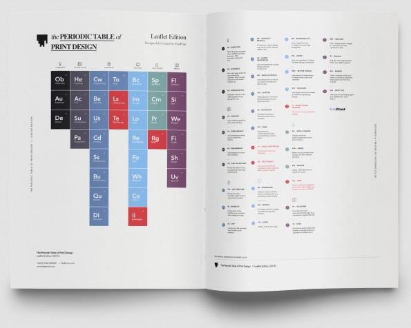
Introducing: The Periodic Table of Leaflet Design – The Simple Way to Design an Effective Leaflet
The Periodic Table of Leaflet Design is an infographic designed by UK-based printing company, FastPrint.co.uk.
It’s a simple graphic that aims to walk you through the leaflet design process step-by-step, in a simple and easy-to-grasp manner.

As you can see, the infographic design is based on that of the periodic table of elements, but instead of chemical elements, the graphic contains all of the elements you’ll need to consider in order to create a successful leaflet for your organisation.
You’ll see that each of the elements are further broken down into a number of different categories, including “Concept”, “Structure”, “Content” and “Pre-Print”, amongst others. The “Design” category (which is where most people put the bulk of their focus when it comes to leaflet creation) contains just eight of the 36 elements (i.e. less than a quarter of the total elements you need to be considering).
Overall, the infographic is pretty simple to follow; you simply work through the categories to plan and design your leaflet. Each element has a numerical value assigned to it (see the upper right-hand corner), which ranges between -3 and +3.
The higher the number, the more important that particular element is (i.e. an element with +3 – such as “Au” – has a higher importance than an element with +1 – such as “Uv”). Elements with negative values are things that should be avoided (e.g. “Rg” – sending your leaflet to the print company while still in RGB colour mode).
There’s also a small snippet of information relating to each element on the infographic, but if you need more detail, check out this lengthy guide
which goes into much more detail about (and gives examples of) each element.

